

In two earlier articles I have discussed how to create a data visualization through a world map showing countries colored in shades representing their value for a selected property. I have introduced d3 and GeoJSON including projection and path generation. I have shown how the geo data (with country shapes in GeoJSON format) can be combined with country specific data (for example in CSV format). I have demonstrated how the color and title of countries can easily be updated when a new property is selected as the one to be visualized.
In this article we will take a closer look at adding some interactivity to the world map. We will look at:
- changing the rotation of the map
- select countries
- country details popup window
- show legend – color scale
In a follow up I will look into zooming/panning/dragging the map.
Rotation of the (projection of the) Map
I am used to a world map that is centered on Western Europe, on zero degrees of longitude. However, depending on the audience, the location of a user and also on the information presented in a map, a different focus maybe desirable.
When we define the projection for a map, we can specify this focus – the rotation of the projection. Through this rotation, we specify how far east or west from the prime meridian the map focus should be.

A rotation of –110 degrees means that the center of the map is 110 degrees east of the prime meridian, putting among other countries Indonesia in the center of the picture.

The rotation is used by the path generator when it turns country border geocoordinates into X,Y pixel coordinates. If you wan to change the rotation of the map, you need to redraw the country shapes with the updated path generator using the projection’s changed rotation.
I have defined an input range element that the user can use to set the rotation by dragging the slider.
 When the slider is moved, the function setRotation() is invoked to make sure the map is updated for this new reality.
In turn it will invoke redrawWorldMap() to redraw the country shapes using the updated projection and displayProperty() to have the country colors reflect the value of the data property currently presented by the map once more.

The global variable mostRecentProperty is used to remember the property for which the map is currently set up as to be able to re-present that property after the the country shapes have been redrawn.
You will find the code here for the index.html page at this stage. Check out the live demo here.
Here is a comparison of the world map rendered with two different values for rotation.

Country Selection & Highlighting
It can be quite convenient to be able to select one or more countries. Simply by clicking on them. Information can be presented for the selected country or countries. The selection can be used elsewhere in the application (for example when filling in a travel form with country of birth or all the travel destinations). The selection can also be a trigger for zooming the map in on the country selection.
In order to implement selection, we need to be able to click on a country shape and have that click event handled. We also need to remember the currently selected countries and we want to highlight these countries. Of course the selection of countries can be expanded – countries can be added by ctrl-clicking. In the same way, currently selected countries can be removed from the selection.
A style is defined for a selected country:

A global object is defined to keep track of currently selected countries

The click handler is defined for every country shape:

When the country shape is clicked, function handleCountryClick is invoked. This function keeps track of all selected countries in the object selectedCountries. The names of currently selected countries are the properties (keys) in this object. When a country is clicked, first the function checks if the CTRL key is held while clicking. If it is, the current selection is respected. If it is not, the country selection is reset and the currently selected countries are deselected. This means that their highlighting is removed (call to unhighlightCountry()) and that the property or key with their name is removed from object selectedCountries.
The selected country itself is either added to the selection if it is not yet in it. Otherwise it is kicked out of the selection.
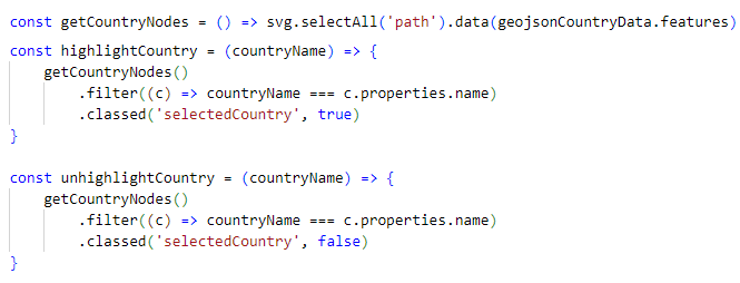
Highlighting and unhighlighting a country boils down to adding or removing the style class selectedCountry from the country’s SVG shape. To find the relevant shape, function getCountryNodes is called to retrieve the selection of all path elements under SVG. From this selection, the proper SVG shape is filtered based on the country name.
 When a country is selected, its border turns a shade of orange, making selected countries stand out (a little). By tuning the style class, more expressive things can be done with selected countries’ highlighting.
This is what a country selection looks like:
We have to take special care to make sure that the country selection is preserved when the rotation of the map is changed.
Function setRotation() invokes function highlightSelectedCountries to re-apply style class selectedCountry to the (redrawn) SVG shapes for these selected countries.

The rotation of the map with the previous country selection is changed (from –110 to 70 degrees). The same countries are still (or more accurately: again) selected and highlighted.

Here is the index.html with both rotation and country selection included. Check out the live demo here.
Country Details Popup Window
It is almost expected behavior I think – although I am not a UX expert – for some information to appear when a country is selected. As shown in this screenshot: a card with country details that appears in a popup [window] when a country is clicked is a useful feature. It should of course be synchronized and show data for the most recently selected country. And when no country is selected, this country card should not be visible at all.

The card itself is defined in HTML, using some CSS style class definitions.

What we need next is some code to manipulate the card: hide it when no country is selected, show it and synchronize it when a country is selected.

The code for hiding and displaying is simple: find the element with class country-box and manipulate its display property. Synchronizing the data elements for the currently selected country’s properties is also quite straightforward: find the span elements that hold the values for the properties and update the textContent for each of these SPANs. Note how easy it is to add properties to the country card.
Here is the current state of the index.html file. Check out the live demo here.
Color Legend to Clarify the Heatmap Color Spectrum
At the moment, when the user hovers over a country, the country’s value for the property on display is shown as hover text. And we know the color is indicative of that property’s value for each country. But we currently do not know how to translate the color shades to property values. A legend to clarify these colors would be convenient. So let’s add one.

The gradient in the legend maps color shades to the values for population density displayed in the vertical axis. When a different property is on display, the legend is synchronized with it.
Here are the map and the legend for Life Expectancy:

The legend is created as an SVG object separate from the map. It floats in a DIV on top of the map.

The SVG element is created in this code as is the color gradient, based on the interpolateBlues function that returns an RGB string of color that corresponds to the sequential color scheme of “Blues”:

The contents of the legend is created with this code – that takes the name of the property to display as its input. Whenever a different property is displayed, this function is invoked again from displayProperty():

The final function involved is drawVerticalAxis() that adds … well, the vertical axis, with ticks and title:

The current state of the index.html file is in GitHub. Check out the live demo here.
Conclusion
In this article, I continue to work with the world map visualization I had created in a previous article. I have added the ability to rotate the map (from east to west), the option to select one or more countries, a popup window to provide details for the most recently selected country and a legend that maps color shades to property values.

In a next article, zooming, panning and dragging will be added.
Resources
GitHub Repository for this article. Check out the live demo here.
My earlier articles on World Map data visualization:
1. Create Interactive World Map to Visualize Country Data – https://technology.amis.nl/frontend/web-html5-css3/create-interactive-world-map-to-visualize-country-data/ – introducing World Map Data Visualization with d3, SVG and JavaScript.
2. Presenting the World in Data using World Map Visualization – https://technology.amis.nl/frontend/presenting-the-world-in-data-using-world-map-visualization/ – bring together a straightforward approach to data visualization (from article one) and a rich data set from Kaggle that provides many interesting details for all countries in the world, related to education, health, economy, demography, climate and more.
