

In this article, I analyze the race that took place in stage 14 of the 2019 Tour de France in a Jupyter Notebook using Python, Pandas and Plotly and based on the Strava performance data published by Steven Kruijswijk, Thomas de Gendt, Thibaut Pinot and Marco Haller. In this previous article I have explained how we can retrieve the Strava data for a specific rider for a stage in the Tour de France, and in this follow up article I have shown how to analyze the data for a single rider (Steven Kruijswijk).
Now it is time to look at the complete picture: the race with multiple contenders in that 14th stage up the Col du Tourmalet. I will bring the data from several riders together in order to inspect and visualize the race as it unfolded on July 20th deep in the Pyrenees. I will be using Python, Pandas and Plotly – the latter for visualizations. One challenge in particular causes some headaches in this notebook: how to align data from different riders who all started their GPS device at different points in time and at different physical locations and therefore have unaligned Strava data sets.
The raw JSON files with Strava data as well as the Jupyter Notebook under scrutiny are in this GitHub repository: https://github.com/lucasjellema/data-analytics-strava-tour-de-france.
This is the 14th Stage in the 2019 Tour de France: 117.5 km (shortened to 111 km on the actual race day – read the report here) through the Pyrenees, finishing with a climb from the Hors Categorie on the flanks of the Col du Tourmalet..

the altitude overview is challenging:

The brief race summary states:
Thibaut Pinot claimed his third stage win in the Tour de France after Porrentruy 2012 and L’Alpe d’Huez 2015 as he stormed to victory at the top of Tourmalet while Julian Alaphilippe, second on the line with a deficit of six seconds, retained the yellow jersey and extended his lead over Steven Kruijswijk and Geraint Thomas. The ranking for stage 14: https://www.letour.fr/en/rankings/stage-14
Load the Data for Three Riders
Let’s load the JSON data from the data files into Pandas Data Frames. From the data file, we get time (in seconds), altitude (in meters), distance (in meters), velocity (in meters/second), geo position (lat/long), watts (in Watt or J/S), cadence and temperature (Celsius). With a little initial processing, we get speed in km/h as well as individual longitude and lattitude columns.

Let’s bring in data from a second rider – Thibaut Pinot – and see if we can compare the data – and so uncover the story of the 14th stage.
Note: we probably have to shift the data a little to properly align the data sets; it is likely that the Strava recordings for the riders did not exactly start at the same moment. They certainly did not end at the same time – as Thibaut Pinot was the winner of this stage, with a substantial lead on Steven Kruijswijk.

Thomas de Gendt did not do so well in this stage – he came in 71st, 20 minutes behind Thibaut Pinot. Yet he also made his performance data available on Strava.

Let’s combine the data into a single data frame. In order to discern between the three riders, let’s first add a column rider to each of the three data sets.

The next chart shows distance vs time for these three riders. Several things should strike you: the riders do not cover the same overall distance and very early on, there distance develops differently – as if they have different speeds from the very beginning. Furthermore: Steven Kruijswijk and Thibaut Pinot finished within 10 seconds of each other – but that is not what the chart is telling us.
Note how easily we can group the data in this chart by rider. By simply specifying the color attribute for the line chart and associating it with the rider column in our data frame that identifies the group, we get three different lines plotted in distinct colors with a legend explaining the groups. That is very little work for a very nice effect!

The next chart makes the issue – of data alignment – even more visible. The chart shows altitude vs time (altitude versus distance would be similarly instructive). It is clear that from the beginning there is some sort of shift or time warp between the riders.
As stated before: the issue is that time as recorded by each of the three riders is not the absolute time. Instead, it is the number of seconds since each riders switched on their recording. And this they did not do at the same time. Thibaut Pinot started recording the latest, probably at the real start of the stage, while Steven and especially Thomas started recording far earlier.
In order to really compare the data and tell the meaningful story of the race, I need to shift the data in time, to make it properly align.

The previous figure is a big help in determining how to align the two riders’ data sets in time. They started and ended their Strava recordings at different moments and probably different locations as well. We can assume that at least the first part of the race they were riding in the same group. So we need to shift Thomas de Gendt’s data (green line) and Stevens’s data (blue line) in time to have it align with Thinaut’s (the red line). We will still find a misalignment later on in the race (because Thibaut got ahead of Thomas), and possibly near the end because the two riders may not have concluded their recordings at the same place.
Note: it is a bit strange that the highest altitude values seem not to be the same for the three riders. It would seem that especially Steven Kruijswijk’s device is incorrectlt calibrated for altitude.
Analyzing the first two smaller peaks in the figure overhead – visually, manually zooming in – for each of the riders suggests that:
- Thibaut’s recording started last
- Steven’s recording started 735 seconds earlier
- Thomas started his Strava data collection 1200 seconds earlier than Steven, some 1915 seconds before Thibaut
Using these gaps, I can shift the times in a way that makes possible a meaningful comparison.
Question: can I find these timeshifts in an automated fashion? Later in this notebook a naive approach for this. I a separate notebook, I will discuss this question depth – it turns out to be an example of a larger class of data series similarity challenges that are extremely relevant (and fun).

The next figure shows altitude vs time after the time shift has been applied. Now the recordings should be aligned and can be compared. We expect at least for the first part of the stage for all riders to have the same altitude at the same time.

We can see that for the first hour or so, all three riders stayed together. Then Thomas started to fall behind as the riders started to climb the Col du Soulor.
Note that the peaks are not exactly of the same heigh: The second heighest col of the day is indicated by Steven at 1511 meters, by Thomas at 1436 m and by Thibaut at 1426 m. The official data from the Tour de France organization puts the top at 1474 m – 60.5 km from the starting point. Do we need some calibration of the data (or the riders of their devices?)?
The Finish on Col du Tourmalet is at 2115 m says the organization. Steven registers 2215m, Thomas 2042m and Thibaut has no higher registration than 2033 m.
Using the shifted time, we can show the distance for each of the riders.

However, because the three riders did not start recording Strava data at the same point, they did not all three have distance == 0 at shifted_time==0 as should be the case. So in order to have the riders start at the same ‘distance’ – we have to shift distance as well as time – by the value distance has for each for them when shifted_time == 0.
The distance shift should be:
* Thibaut – shift 0
* Steven – shift 6545 meter (ignore the 6545 meters that Steven covered before Thibaut even started recording)
* Thomas – shift 14380 meter (disregard the more than 14KM recorded by Thomas before the start of the stage)
Finding and Applying Time Shift programmatically
Let’s see if we can find the shift in time by analyzing the data – especially the GPS coordinates. We know that at the beginning of the stage, our three riders stayed together in the same group. Their recorded time and distance are different – even if in reality they are the same. By finding the recorded time and distance for the entries that we know have been recorded at the same absolute time and location, we can determine the relative time (and distance) shift for each rider.
We know that in first hour of the day, these three riders were riding in the same group. If we pick say four points in the first 4000 seconds for one of the riders – say Thibaut – (and note the time values for these four) and then try to find the four entries closest to these for each of the other riders – that should give us time values for the other riders as well. For the difference in time value for those four points should roughly be the same – their average gives us a good estimate for the time shift needed for Steven’s data. The same applies to Thomas and his four points.

Here is a function to calculate the distance between two locations defined by longitude and lattitude; note: for my purpose, I could probably also use a simple Euclidean distance (based on Pythagoras), disregarding the spherical characteristics of the Earth’s surface and save some time.

Next, select four reference points from the reference rider: Thibaut Pinot; note: the values of 1500, 1800, 2100 and 2400 are arbitrary; with other values, the findings should be the same.

Four reference GPS locations are selected in thibauts_points. A function is available to calculate the distance between two GPS locations.
Next, I will loop through the four GPS locations and for each location iterate through the first 4500 entries in Steven Kruijswijk’s data set to find the closest entry in terms of distance to the GPS location. The timeshift and distance shift for that entry between Thibaut and Steven is added to the time_shift_sum and distance_shift_sum variables. After all four locations are inspected, the averages of time_shift_sum and distance_shift_sum is taken and these values are the values for the shift we need to apply. And of course these values should be very similar to what I determined visually and manually from the chart of altitude vs time by comparing the lines for Steven and Thibaut (which was a timeshift of 735 seconds).
After handling this for Steven, I will do the same for Thomas.

The timeshift for Steven vs Thibaut = – 739 seconds. Steven’s recordings catch up with Thibaut’s after 739 seconds on average, suggesting that Thibaut started his Strava recording 739 seconds later than Steven did. That means that when it comes to comparing distance between Thibaut and Steven, we should ignore for Steven the distance recorded for the first 739 seconds and start measuring from that point onwards. The average distance shift – the difference in distance recordings – is equal to 6461 meter. So in order to compare the Strava recordings for Steven and Thibaut, we have to shift the former data set by 739 seconds in time and 6461 meter in distance. Since these two are the only two ‘aggregate’ values – as opposed to absolute readings like altitude, temperature, watt, GPS location – these are the only we need to cater for.
By changing rider from steven to thomas we can easily find the accurate time and distance shift for Thomas de Gendt:
- Timeshift: 1915 seconds
- Distance Shift: 14237 meters
Thomas started recording far earlier than both Steven and Thibaut

Apply the time and distance shift to the data for Steven and Thomas – a small correction with regard to the earlier adjustment.

Analyzing the Race
Now that we have the data neatly aligned for all three riders we can use it for some race analysis through visualization of distance, time gaps, altitude.
Let’s create a chart of distance vs time using the shifted time and distance to see what it tells us about this stage in the Tour de France.

This tells the story quite well. We can see how Thomas started to fall behind Steven and Thibaut after 4500 seconds (46 km into the stage, based on Thibaut’s distance measuring). The Strave data resolution does not seem accurate enough to see the difference beteween Thibaut and Steven (6 seconds).
Time versus distance at any moment during the race
The next figure does something interesting: it shows time vs distance. In other words: it shows for each position along the route when each rider got there. And by comparing the lines for the riders, it reveals the timegap between the riders at each stage in the race. It roughly indicates a difference at the finish (the last recorded distance for Thibaut) of 1200 seconds or 20 minutes, which is indeed the result reported in the offical classification for the stage.
Note how we can add annotations to a Ploty Chart to add meaning and clarification to the data visualization.

The next figure shows how zooming in helps to reveal the exact time gap at any point along the route, in this case at the finish:

Altitude vs Time for each of the riders
The altitude profile for this stage is quite distinct and the mountains play an important role in this stage. The next figure tells the stories of three men vs the mountains – with one man (Thomas) slowly falling behind on those steep climbs…


The Early Get-Away group – with Marco Haller
I would like to add the story of the early get away group. The first one to attack was Vicenzo Nibali. Unfortunately, he did not publish Strava data for this race. Someone who joined Nibali fairly early on – a member of a group of 17 riders – who did share his data is Marco Haller. By adding his data to the mix, we can see the early developments in the race.
Note: Marco Haller finished after 03H 36′ 41” (13001 seconds) with a time lag compared to Thibaut Pinot of 26′ 21” (1581 seconds behind)

Of course Marco did not start his Strava recording at the same time as Thibaut, so once again we have to compensate for a time shift. Let’s take a brief look at the shift by comparing Marco’s altitude vs (unshifted) time with those of the other three riders.
We notice that Marco’s recordings are the later than Thomas’s but earlier than those from both Steven and Thibaut.

Using the same approach for finding the true time shift and distance shift as before, this time using GPS locations from early on in the stage as we know that Marco parted ways with Thibaut very early on, we can quickly determine how to adjust Marco’s data set.

Next, apply all time shifts and distance shifts. Note: we only need to do this for Marco Haller as the data was already set for the other riders

Distance vs Time – showing Marco Haller’s early lead and later gap
The next figure shows the distance covered by each rider as a function of time. Marco Haller was part of the early break away group and covered more distance than Thibaut Pinot for example. After some time however, he was overtaken and subsequently fell behind.
His lead in meters and later his lag vs the other riders can easily be read from this figure (by drawing a vertical line can finding the difference along that line for each of the crosspoints)

Timing Summay in a Chart
The next chart shows time vs distance. It shows for each rider at what time they reached a certain distance. Initially those times are the same, then Marco’s times are earlier and after his capture by the main pack, slowly and surely his times are getting later – for reaching a certain distance. The finish line (a vertical line at the total distance for the stage) is added. The differences along this line between the riders are the time difference in the official ranking for this stage. For Marco Haller this difference with Thibaut is 1581 seconds.
The annotations tell some of the story of the stage.

And the resulting figure:

Time Lag and Distance Lag throughout the Race
One of the reasons I got interested in analyzing Tour de France data is the way during the race the time difference between the race leader, chasing groups and the main pack is presented. I have wondered as to the exact meaning of a certain time lag between the leader and the chasers: if Marco is 25 seconds ahead of Thibaut – what exactly does that mean? And I wondered how this value was determined – in a technical sense. How was it done? Is it streaming analysis on live timestamped GPS coordinates for each of the riders or at least for the motor bikes accompanying the riders? In this year’s live coverage of the Tour de France, they added ecart – or distance – in meters. That is easier to determine it would seem.
In this final section in this notebook, I take a closer look at those lags – both time and distance. And in order to make the calculations and visualizations go a little faster and make it easier to join registrations for different readers, I will use fewer data points. Instead of one data point per second, I will aggregate to time_windows of 30 seconds and distance windows of 300 meter.
Note: In order to determine the time gap between two riders at a certain distance, I need records for both riders at that distance. The raw data has fairly high granularity in distance, so the chances of two riders having records for that exact same distance are slim. That is why the data need to be aggregated to distance windows that have low enough granularity as to be present in each rider’s set.


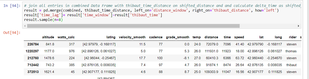
Create data frame result with entries for all riders that consist of the original records from data frame combined complemented with the corresponding entry from thibaut_time_distance joined on time_window. Next, calculate the distance_lag as shifted_time minus Thibaut’s shifted_time

Distance Lag throughout the Race between Riders and Thibaut
The next figure shows the distance in meters between each rider and Thibaut Pinot throughout the stage. We can see how Marco Haller gets ahead of Thibaut, as far as 2200 meter, before slowly losing this lead and then losing Thibaut out of sight up to a distance of over 5000 meter.
I wonder if the oscillation in the data sets – especially Steven’s – is meaningful or a fluke of either the measurement or the data wrangling I have performed.

Time Lag throughout the Race between Riders and Thibaut
Recreate data frame result with entries for all riders that consist of the original records from data frame combined complemented with the corresponding entry from thibaut_time_distance joined on distance_window. Next, calculate the time_lag as shifted_time minus Thibaut’s shifted_time

The next figure shows the time gap in seconds between each rider and Thibaut Pinot throughout the stage – as well as the altitude vs distance.
We can see how Marco Haller gets ahead of Thibaut, as far as 180 seconds, before slowly losing this lead and then getting behind Thibaut to a final time gap of more than 1500 seconds.
The impact of the two large mountains is clear: Marco gets overtaken half way on the ascent of the Col du Soulor and loses time rapidly in the remainder of the climb. During the descent and in the first section on the climb of Col du Tourmalet, the time gap stabilizes before quickly growing again as the Tourmalet gets steeper and goes on and on.
Plotly Express currently has limited support for multiple axes and distinct data sets. Therefore I resort to regular Plotly facilities.


Resources
Article on mining Strava Data, explicitly discussing segment data for the Col du Tourmalet: http://olivernash.org/2014/05/25/mining-the-strava-data/
Report on the 14th Stage in the Tour de France of 2019: https://www.letour.fr/en/news/2019/stage-14/thibaut-pinot-takes-revenge-for-crosswinds-disaster/1280846 . Another report: http://www.cyclingnews.com/tour-de-france/stage-14/results/ with the story of the stage, including summary of breakaways and the extended neutralised section of the stage. As a result – the actual race was 109 km in length. And: the at the time live blog for The Guardian: https://www.theguardian.com/sport/live/2019/jul/20/tour-de-france-2019-stage-14-takes-race-up-to-finish-on-tourmalet-live.
Online JSON Editor – convenient for quickly checking on JSON data copied/pasted from Strava – https://jsoneditoronline.org/
Introduction to Interactive Time Series Visualizations with Plotly in Python by Will Koehrsen – https://towardsdatascience.com/introduction-to-interactive-time-series-visualizations-with-plotly-in-python-d3219eb7a7af
Installing plotly (4.1): see: https://plot.ly/python/getting-started/ Introducing Plotly Express: https://medium.com/plotly/introducing-plotly-express-808df010143d
Plotly Reference on Axes, Annotations, Shapes etc: https://plot.ly/python/reference/#layout-xaxis