
One of the very interesting JSF components that ADF 11g RichFaces has put in our hands is the Pivot Table. I have blogged about that component a while back (see ADF Faces 11g: Reloading the Matrix – using the Pivot Table component) – and now it is time to take the next step with this component. I have been getting some assistance from the ADF DVT team – Katia’s gang – and with their help I am able to demonstrate some ‘second step’ functionality for the pivot table – things that you do not do in the Pivot Table 101, that I described in the previous article.

First we create the Pivot Table – Timesheet – based on a Placeholder Data Control (with static sample data). We will run the page that contains the Pivot Table and see how versatile this already is. We will create a context sensitive context menu that displays additional information about the cell for which it was opened. We will also see how we can add data specific formatting to the cells.
Create the Placeholder Data Control
The Pivot Table in this article is based on a Placeholder Data Control. It implements an on line Timesheet where hours are presented for activities on projects on a week by week and daily basis. In this article I will use the pivot table data binding created through drag & drop of the Data Control’s data type. However, to get the full range of functionality the Pivot Table can offer, we should implement the PivotTableDataModel ourselves and not rely on this data binding model.
From the New Gallery,. create a new Data Control of type Placeholder Data Control. I called it TimesheetSampleDataPlaceholder. Right click on the Data Control in the Data Control palette and pick the option to Create Placeholder Data Type. In the window that pops up, specify the following:

On the second tab – sample data – enter some sample records:

Press OK. Now the Data Control with its data type are visible in the Data Control palette and can be used to bind pages to.
Create JSF page with PivotTable
Create a new JSF page – from the New Gallery. I called the page TimesheetReport.jspx. Drag the TimesheetEntries collection under the TimesheetSampleDataPlaceholder Data Control to the new page and drop it as ADF Pivot Table. This will create a Pivot Table data binding in the PageDefinition file as well as a dvt:pivotTable component in the JSF page; this component has its value attribute bound to the pivotTable data binding.

The Pivot Table dialog window pops up. In the first page, we can specify which attributes from TimesheetEntries are to be displayed in the PivotTable and if so, where: row edge, column edge or in the cells.

On the third tab we can specify the desired aggregation of values. It would be nice to have totals for the hours per project and per week. (And later on per day. Or per anything really). The initial labels for the aggregates should indicate of course what the aggregates represent. Generic labels such as Total, Sum (hours), Overall # hours etc. usually work well. More specifically we could use a label such as "Summary across all projects" (or All Projects Total) and "Hours for all weeks" when aggregating by Project or WeekNo.
When naming the aggegrate attributes you should remember that the user may – when so allowed – pivot the table; that is: to move columns to rows and vice versa – the initial naming may then be not as useful. So choose carefully!

We can now take a look at a preview of the PivotTable as we have configured it so far:

Finally I drag the right frame of the pivot table a little further to the right to make all columns visible.
Running the initial Timesheet PivotTable application
Time to give it a try. Run the jspx file to see what the pivot table looks like for real:

This is what it looks like initially. However, since we have left the pivot table property PivotEnabled at its default value (true), users can manipulate the pivot table, to make it look like any of the three following layouts:

Or:

You will notice that the labels used for the aggregate values might have somewhere along the way lost their meaning if I had defined them to specifically (something Total across all projects and all activities would not work well).
Context Sensitive Popup (Context) Menu
One of the attributes in the original Placeholder Data Control was the Description. For each timesheet entry, the user can provide a description to explain the what, how and why of the entry. However, this description is not displayed in the pivot table. I would like to add functionality to the table: when the user selects a cell and right clicks on it, a pop up should appear that displays the description for that entry.
The first steps are very simple: link a popup to the cells of the pivot table. First we create a popup element:
        <af:popup id="pivotCellPopup" contentDelivery="lazyUncached">
          <af:outputText value="The description for the cell"/>
        </af:popup>
and next we set the contextMenuId property for the pivotTable:
contextMenuId="pivotCellPopup"
This is all it takes to have a context menu displayed. However, to make it display the Description associated with the selected cell is a slightly more complex story.
We need a managed bean to which we bind the pivotTable. This bean will provide the appropriate Description to the popup. Let’s set the binding property for the pivotTable – creating a new managed bean and a new class in the process:

Set the pivotTable’s binding property:
        <dvt:pivotTable id="pivotTable1"
                        value="#{bindings.TimesheetEntries.pivotTableModel}"
                        inlineStyle="width:595px;"
                        contextMenuId="pivotCellPopup"
                        binding="#{viewScope.TimesheetPivotTableManager.timesheetPivotTable}"/>
and set the value property for the outputText component in the popup:
        <af:popup id="pivotCellPopup" contentDelivery="lazyUncached">
          <af:outputText value="#{viewScope.TimesheetPivotTableManager.description}"/>
        </af:popup>
The value for the description to be displayed in the popup will be provided by the new managed bean TimesheetPivotTableManager.
The real work for getting at the description value is done inside the class TimesheetPivotTableManager that sits underneath the bean.
public class TimesheetPivotTableManager {
    private UIPivotTable timesheetPivotTable;

    public TimesheetPivotTableManager() {
    }

    public void setTimesheetPivotTable(UIPivotTable timesheetPivotTable) {
        this.timesheetPivotTable = timesheetPivotTable;
    }

    public UIPivotTable getTimesheetPivotTable() {
        return timesheetPivotTable;
    }

    public String getDescription() {
        Selection sel = timesheetPivotTable.getSelection();
        DataCellSelectionSet cellSet = sel.getDataCells();

        DataAccess da = timesheetPivotTable.getDataModel().getDataAccess();
       // assuming that a single cell is selected!
        DataCellRange cell = cellSet.iterator().next();
        DataCellIndex start =
            cell.getStartIndex(timesheetPivotTable.getDataModel());
        int startRow = start.getRow();
        int startCol = start.getColumn();
        QDR qdr;
        try {
            qdr = da.getValueQDR(startRow, startCol, da.QDR_WITHOUT_PAGE);
            String weekNo = (String)qdr.getDimMember("WeekNo").getData();
            String project = (String)qdr.getDimMember("Project").getData();
            String activity = (String)qdr.getDimMember("Activity").getData();
            String dayOfWeek = (String)qdr.getDimMember("DayOfWeek").getData();


            // now we go to the iterator and find the row with this combination of key values
            // from that row we want to know the Description
            DCIteratorBinding iter = getDataIterator();
            RowSetIterator rsi = iter.getRowSetIterator();
            rsi.reset();
            Row row;
            while (rsi.hasNext()) {

                row = rsi.next();
                oracle.jbo.domain.Number rowWeekno =
                    (oracle.jbo.domain.Number)row.getAttribute("WeekNo");
                String rowDayOfWeek = (String)row.getAttribute("DayOfWeek");
                String rowActivity = (String)row.getAttribute("Activity");
                String rowProject = (String)row.getAttribute("Project");
                // assuming that none of these values can be empty/null
                if (rowWeekno.compareTo(Integer.parseInt(weekNo)) == 0 &&
                    rowDayOfWeek.equalsIgnoreCase(dayOfWeek) &&
                    rowActivity.equalsIgnoreCase(activity) &&
                    rowProject.equalsIgnoreCase(project)) {
                    return (String)row.getAttribute("Description");
                }
            }

        } catch (RowOutOfRangeException e) {
        } catch (ColumnOutOfRangeException e) {
        }


        return "";
    }

    public DCIteratorBinding getDataIterator() {
        ADFContext ctx = ADFContext.getCurrent();
        FacesExpressionEvaluator elev =
            (FacesExpressionEvaluator)ctx.getExpressionEvaluator();
        Object iterator =
            elev.evaluate("#{bindings.TimesheetEntriesIterator}");
        return (DCIteratorBinding)iterator;
    }
That is quite a bit of code. The first step is to get the current CellSelection from the PivotTable. In this simple example we assume that a single cell is selected. From the cell selection we determine the cell coordinates – row and column. With these coordinates, we get the QDR – the Qualified Data reference. The QDR then provides access to the values of the Dimensions – WeekNo, DayOfWeek, Project and Activity. Note: these can be row or column values depending on how the user has manipulated the pivot table.
With the values for the composite ‘key’ – the timesheet entries do not have a formal key; however, the combinatioin of the four dimensions mentioned should be unique – we can now try to find the corresponding row in the TimesheetEntriesIterator. From that row we finally get the value of the Description attribute, and that value is returned to the af:outputText in the popup.
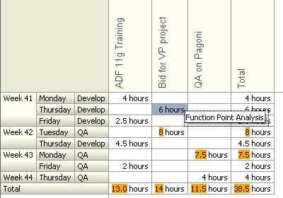
When we run the page again, the result looks like this:

Note: I received valuable assistance from the ADF DVT team in putting this code together. I really appreciate their help!
Data Specific Styling of Cells
In this step I go for a simple requirement: if the number of hours exceeds six, I want the value to be displayed with an orange background. It would also be nice to display the word hours in the cells, to make the contents more accessible. For this, we can use the <dvt:dataCell> child element in the pivotTable.
The dataCell can be used to explicitly specify what should be rendered in the cells of the pivotTable, thus giving us much more control over appearance, contents and even functionality of the table. Via the dataCell, we can incorporate input elements in the cells of the pivotTable!
A fair question would be: how to paint the entire cell background orange. I think that can be done through the dataFormat attribute that can be set on the pivotTable. I hope to investigate that at a later time.
For now, I hace created thed following dataCell within the pivotTable. Also note the var and varStatus attribute that have been configured, to provide the dataCell with a means to access the value intended for the cell:
        <dvt:pivotTable id="pivotTable1"
                        value="#{bindings.TimesheetEntries.pivotTableModel}"
                        inlineStyle="width:595px;"
                        contextMenuId="pivotCellPopup"
                        binding="#{viewScope.TimesheetPivotTableManager.timesheetPivotTable}"
                        var="cellData" varStatus="cellStatus">
          <dvt:dataCell dataAttribute="Hours">
            <af:panelGroupLayout>
              <af:outputText value="#{cellData.dataValue}"
                             inlineStyle="#{cellData.dataValue gt 6?'background-color:orange;':''}"/>
              <af:outputText value=" hours"
                             rendered="#{cellData.dataValue!=null}"/>
            </af:panelGroupLayout>
          </dvt:dataCell>
        </dvt:pivotTable>
When we run the page again, it shows up in the browser like this:

I am sure that in future installments, there is a lot to be explored and discovered, both for the pivot table as well as for other ADF Faces DVT components.
Small Improvements
Diar from the DVT team pointed me at theHeaderFormat callback/MethodExpression that I can use to set very specific labels for the Aggregates to support my users to great length. This method checks if a total cell is being rendered and changes the label by specifying a new raw value ( cellFormat.setNewRawValue(newLabel) ). I will try that out. For now I will just choose very generic labels for the aggregates:
The live pivot table in my browser looks like:

Add "Week" to the weekno labels and set the column labels to vertical text
Just using the weekno can be a bit confusing, so it would be nice to add the string Week to the column label. Furthermore, the text in the column labels can grow quite wide, so we will put them vertically (from top to bottom).
Such changes in headers can be achieved using the headerFormat property
        <dvt:pivotTable id="pivotTable1"
                        value="#{bindings.TimesheetEntries.pivotTableModel}"
                        inlineStyle="width:595px;"
                        contextMenuId="pivotCellPopup" startColumn="1"
                        binding="#{viewScope.TimesheetPivotTableManager.timesheetPivotTable}"


                        var="cellData" varStatus="cellStatus"
                        headerFormat="#{viewScope.TimesheetPivotTableManager.getHeaderFormat}">
the corresponding method is implemented like this:
    public CellFormat getHeaderFormat(HeaderCellContext cxt) {
        Object[] dims = cxt.getQDR().getDims().toArray();

        CellFormat format = new CellFormat(null, "", "");
        if (cxt.getEdge() == DataDirector.COLUMN_EDGE) {
            String textStyle = "writing-mode:tb-rl;filter:flipV flipH;";

            format.setTextStyle(textStyle);
        }
        // only if the last DimMember is for WeekNo then we want to add "Week"
        if (dims[dims.length - 1] instanceof String &&
            "WeekNo".equalsIgnoreCase((String)dims[dims.length - 1]) &&
            cxt.getQDR().getDimMember("WeekNo").getType() != QDRMember.TOTAL) {
            format.setNewRawValue("Week " + cxt.getValue());
        }
        return format;
    }
the effect in the PivotTable looks like this:

More improvements
I do not like the way in which the cells are highlighted. I would prefer to have the whole cell highlighted, not just the value. Furthermore, highlighting should not apply to totals – it seems pretty obvious that hour aggregates for a project or week exceed 6 or 8. So those cells should be exempt from highlighting.
Finally, I would like to see proper labels for the totals. In the image above, the horizontal total is a project total, the vertical total is the aggregate of hours per week, day and activity (across all projects). The labels should say so!
Highlighting cells can be done by a method in a backing bean. This method is called before a cell is rendered. The method can manipulate the value made available for display in the dataCell. It can also set the style to be used for the cell. I have implemented the method here to set the cell’s background color to orange for cells with a value of 6 hours or more, but only in non-aggregate cells:
    public CellFormat getCellFormat(DataCellContext cxt) {
        CellFormat format = new CellFormat(null, "", "");
        Object[] dims = cxt.getQDR().getDims().toArray();
        boolean noAggregate = true;
        // on any dimension
        for (Object dim : dims) {
            noAggregate =
                    noAggregate && cxt.getQDR().getDimMember((String)dim).getType() !=
                    QDRMember.TOTAL;
        }
        Object cellValue = cxt.getValue();
        if (cellValue != null) {
            format.setNewRawValue(" Hours");
        }
        if (noAggregate &&
            ((cellValue instanceof Double && ((Double)cellValue).compareTo(new Double(6)) ==
              1) ||
             (cellValue instanceof Long && ((Long)cellValue).compareTo(new Long(6)) ==
              1))) {
            format.setStyle("background:orange");
        }
        return format;
    }
The method is associated with the pivotTable through the data
        <dvt:pivotTable id="pivotTable1"
                        value="#{bindings.TimesheetEntries.pivotTableModel}"
                        inlineStyle="width:595px; height:398px;"
                        contextMenuId="pivotCellPopup" startColumn="1"
                        binding="#{viewScope.TimesheetPivotTableManager.timesheetPivotTable}"
                        var="cellData" varStatus="cellStatus"
                        headerFormat="#{viewScope.TimesheetPivotTableManager.getHeaderFormat}"
                        dataFormat="#{viewScope.TimesheetPivotTableManager.getCellFormat}">
The dataCell itself is slightly changed as well. The word hours is no longer written inside the dataCell but instead in the getCellFormat method. Hence the af:outputText that rendered Hours can be modified; it now renders only if the getCellFormat method has provided a new raw value; if so, it renders that value:
          <dvt:dataCell dataAttribute="Hours">
            <af:panelGroupLayout>
              <af:outputText value="#{cellData.dataValue}"/>
              <af:outputText value="#{cellStatus.cellFormat.newRawValue}"
                             rendered="#{cellStatus.cellFormat.newRawValueAvailable}"/>
            </af:panelGroupLayout>
          </dvt:dataCell>
Time to take a look at the Total labels: we want the Total label to specify exactly what is aggregated in the row or column the label is providing information about. Therefore we want the label to include the names of the columns (for a row total) or rows (for a column total).
To this end, we add the following code to the getHeaderFormat() method
   ...
     //write proper Total labels (depending on what is actually being totaled)
        boolean aggregate = false;
        for (Object dim : dims) {
            if (cxt.getQDR().getDimMember((String)dim).getType() ==
                QDRMember.TOTAL) {
                aggregate = true;
            }
        }
        if (aggregate) {
            DataAccess da =
                this.timesheetPivotTable.getPivotTableModel().getDataAccess();
            int edgeToGroup =
                cxt.getEdge() == DataDirector.COLUMN_EDGE ? DataDirector.ROW_EDGE :
                DataDirector.COLUMN_EDGE;
            String grouped = "";

            try {
                for (int i = 0; i < da.getLayerCount(edgeToGroup); i++)
                    try {
                        QDR layerQdr =
                            da.getLayerQDR(edgeToGroup, i, DataAccess.QDR_WITHOUT_PAGE);
                        grouped =
                                grouped + (i > 0 ? ", " : "") + layerQdr.getDimensions().nextElement();
                    } catch (EdgeOutOfRangeException e) {
                    } catch (LayerOutOfRangeException e) {
                    }
            } catch (EdgeOutOfRangeException e) {
            }
            format.setNewRawValue("Total (per " + grouped + ")");

        }
...
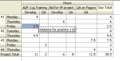
The result after making these changes looks like this:
When we pivot the table a little – drag the activity from the column edge to the row edge -, it looks as follows:

Note how the Total labels have changed.
And more refinements yet…
As the DVT team closely reads this article, they have been helping me along with further improvements. For example the getDescription() method can be simplified quite a bit because all elements of the Key for Timesheet-entries are available. That means instead of my clumsy iterating over all rows to find the one that matches the combination of dimension values, I can use this code here (thanks Dave):
    public String getDescription() {

        Selection sel = timesheetPivotTable.getSelection();
        DataCellSelectionSet cellSet = sel.getDataCells();

        // assuming that a single cell is selected!
        DataCellRange cell = cellSet.iterator().next();
        DataCellIndex start =
            cell.getStartIndex(timesheetPivotTable.getDataModel());
        int startRow = start.getRow();
        int startCol = start.getColumn();
        DataAccess da = timesheetPivotTable.getDataModel().getDataAccess();
        try {
            Key rowKey =
                (Key)da.getValue(startRow, startCol, DataMap.DATA_ROWKEY);
            if (rowKey != null) {
                DCIteratorBinding iter = getDataIterator();
                RowSetIterator rsi = iter.getRowSetIterator();
                Row r = rsi.getRow(rowKey);
                if (r != null) {
                    return (String)r.getAttribute("Description");
                }
            }
        } catch (RowOutOfRangeException e) {
        } catch (ColumnOutOfRangeException e) {
        }
        return "";
    }
Note how much more elegant this is. Also note that the functionality achieved with this is the same as we had before.
The issue of settings the labels for the aggregations does not have to be resolved with dynamic labels. If you think carefully what the aggregate means, you can do well with fixed labels. For example: the aggregate for the Project attribute is shown like another Project – it shows the aggregate across all projects per week or weekday. The same with WeekNo aggregate: it shows the aggegate over all weeks. The term Week Total in my view would suggest an aggregate for one week across all Projects (and activities). Then as soon as you start pivoting the terms slight change their meaning – that is why I dynamically assign the labels. However: with labels set to Total over all projects (Project) and Total over all weeks (WeekNo) things work out right – the intent is clear (to me) and stays correct during pivoting.
Resources
Download the JDeveloper 11g Application associated with this article: PivotTableTimesheetDemo.zip.

Hi Lucas,
    I have implemented the Pivot table in my application. Your blogs helped me a lot.
But one of my pivot table requires to be filled with the products of the edges, I failed to fill the cells with the products.
I post the scenario in otn
pls find the url
https://forums.oracle.com/forums/thread.jspa?threadID=2309744&tstart=0
Can you pls help me to sort out this issue.
Thanks,
   Ranjith
Hi Lucas,
I use jdev 11.1.2.0Â . when i want to create a pivot table no preview data is available .
Preview timed out.
Â
Hi,
I would like to know if it is possible to create a pivot table without bounding it to a data control.
I mean that I would like to create my own PivotTableModel. Do you have an example on how it can be done?
Thanks
Orly
Hi,
Could you give me some idea about povot table selection, my reqirement is if row or column header is being selected then how do we get the selected rows/column data.
thanks,
Saurav